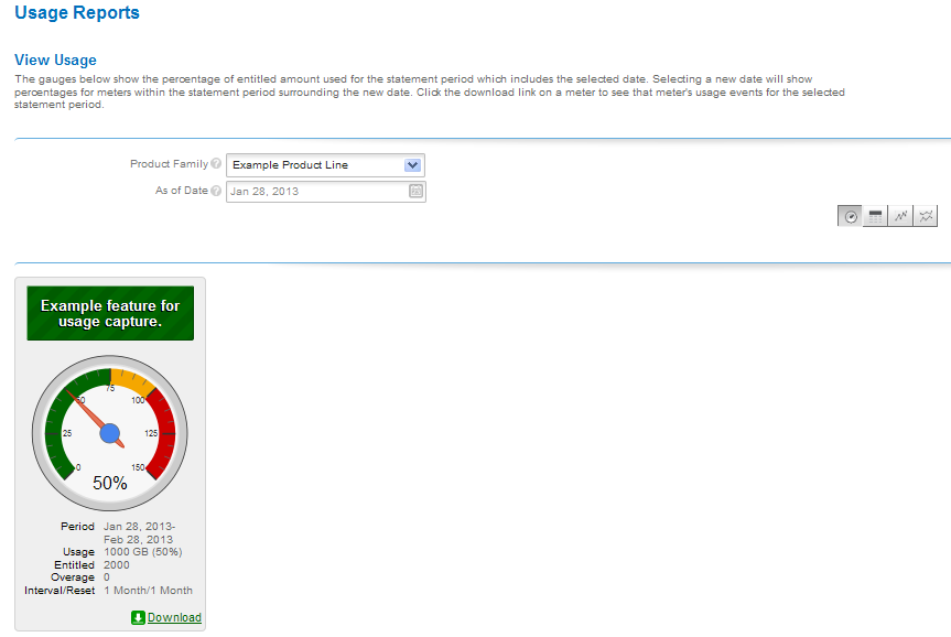
This type of graph shows usage data as a graphical gauge representing the percentage of usage compared to the overall entitled amount. The green region of the gauge indicates usage of none to 75 percent of the available count; the yellow region indicates 75 percent to 100 percent of the available count; and the red region indicates over 100 percent (overage) of the entitled amount.
Usage gauge
Details of the usage information are displayed beneath the gauge.
FlexNet Operations 2020 R1 User GuideFebruary 2020 |
Copyright Information | Flexera |