About Usage Report Types
Usage reports render usage data for a selected customer account. There are four usage report types:
|
Usage Report Types |
Description |
|
Usage Gauges |
Usage data rendered as gauges for each meter. |
|
Usage Tables |
Usage data represented in a tabular format. |
|
Usage Timelines |
Usage data for a single meter graphed by date (according to usage model settings). |
|
Usage Comparisons |
Usage data for multiple meters graphed by date (according to usage model settings). |
Use the report type buttons to select the type of graph in which to display the usage data.

Buttons for selecting the usage report type
Usage Gauges
This type of graph shows usage data as a graphical gauge representing the percentage of usage compared to the overall entitled amount. The green region of the gauge indicates usage of none to 75 percent of the available count; the yellow region indicates 75 percent to 100 percent of the available count; and the red region indicates over 100 percent (overage) of the entitled amount.
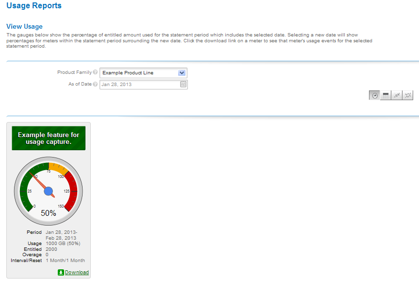
Usage gauge
Details of the usage information are displayed beneath the gauge.
Usage Tables
Usage information can also be displayed in a textual table.
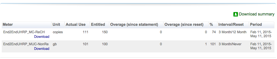
Usage table
Usage Timelines and Comparisons
Usage information can also be displayed in an interactive Flash-based timeline. Commands in the upper left corner enable zooming in to different time periods, and you can click and drag the graph left and right to control the dates for which data are being displayed.

Interactive usage timeline
A similar interactive option is the Compare Meters graph, which simultaneously displays multiple features’ usage information over the same period of time.
See Also