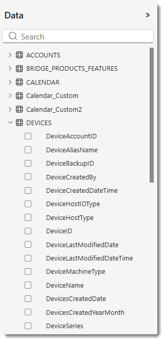
The Data Pane
The Data pane displays the fields available for building visualizations.
Drag a field onto the report canvas to create a new visualization, or drop it onto an existing visual to enhance it with additional data. Alternatively, drag a field onto a specific bucket (for example, in a bar chart, you could drag the ProductLine data field onto the X-axis bucket to have all product lines represented on the X-axis).
When you select a field by checking its box, the Analytics functionality adds it to the active or newly created visualization and automatically places it in the most appropriate bucket—such as Axis, Legend, or Values. This placement is a best estimate, and you can move the field to a different bucket if needed.
Each selected field appears in the Visualizations pane on the report canvas.
When you create a visual, the Analytics functionality automatically adds its fields to the visual-level filters area. However, you can also apply a filter using a field that isn’t part of a visual. To do that, simply drag that field into the appropriate filter area in the Filters pane.