The Visualizations Pane
The Visualizations pane is where you choose the type of visualization to create. The icons represent the different visualization options available, and the selected icon indicates the current visual type—for example, a scatter chart. If you begin creating a visual by adding fields before selecting a visualization type, the Analytics functionality automatically selects a suitable visual for you. You can keep this selection or change it at any time by choosing a different icon.
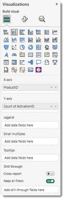
The buckets in the Visualizations pane change depending on the type of visualization you choose. For example, selecting a bar chart displays buckets such as X-axis, Y-axis, Legend, and Values. When you select a Data item or drag it onto the canvas, the Analytics functionality automatically places the Data item into an appropriate bucket. You can also drag Data items directly from the Data pane into specific buckets.
Some buckets only accept certain data types. For instance, the Values bucket requires numeric data. If you drag a categorical field into Values, the Analytics functionality automatically converts it to a count.
This area of the pane also includes options for managing drill-through behavior and filter interactions.
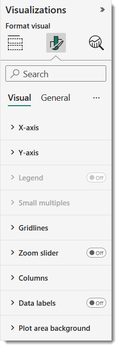
In the Visualizations pane, select the paintbrush icon ![]() to open the Format visual options. The available settings vary based on the type of visualization currently selected.
to open the Format visual options. The available settings vary based on the type of visualization currently selected.
Adding Analytics to Your Visualization
On the Visualizations pane, click the magnifying glass icon ![]() to access the Analytics area. The available options depend on the type of visualization currently selected.
to access the Analytics area. The available options depend on the type of visualization currently selected.
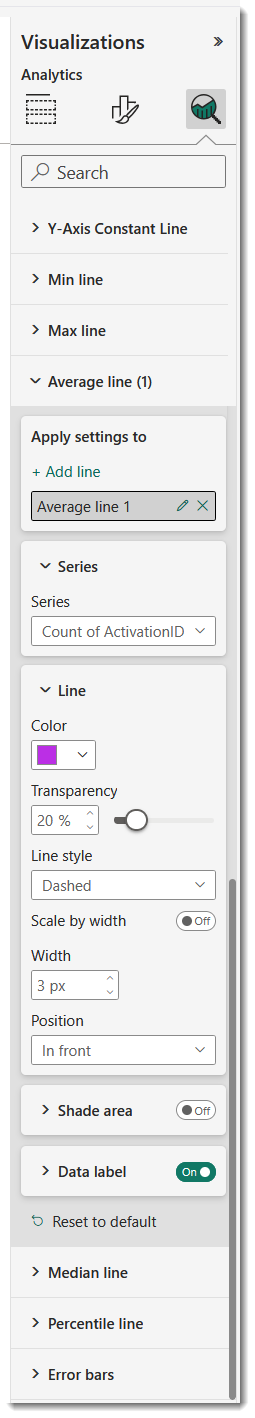
Using the Analytics functionality, you can add dynamic reference lines to visuals, helping highlight key trends and draw attention to important insights.