Devices Tile
The Devices tile shows the total number of devices recorded over the past 12 months.
Analyzing Devices Graphs
Monitoring trends in device creation and updates offers valuable insights into customer engagement levels and overall account health.
Analyzing Device Creation Trends
A spike in device creation often signals:
|
•
|
New customer onboarding. |
|
•
|
Expansion within existing accounts. |
|
•
|
Positive account health check. |
A decline or plateau in device creation—especially when correlated with other indicators such as strategic shifts, product roadmap changes, or usage patterns—may indicate:
|
•
|
Customer disengagement. |
|
•
|
Technical or onboarding issues. |
|
•
|
A need for proactive outreach by Customer Success Managers (CSMs) to re-engage and support the customer. |
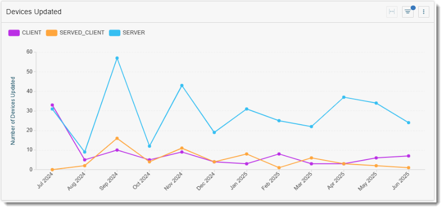
Analyzing Device Update Trends
Frequent updates suggest:
|
•
|
Active usage and healthy operational practices. |
|
•
|
Customers are keeping devices current, possibly adopting new features. |
Infrequent or declining updates may indicate:
|
•
|
Reduced engagement or usage. |
|
•
|
Potential technical challenges or lack of awareness. |
|
•
|
An opportunity for CSMs to check in, understand the cause, and offer support. |
Quick Filters for Entitlements
|
•
|
Created Date (dynamic options available, such as, today, yesterday, last 7 days, last 30 days, current month and previous month) |
Visualizations for Devices
Click the Devices tile to access the following visualizations:
|
•
|
Pie Chart “Device Types”—Shows the relative distribution of device types. Devices are grouped into: |
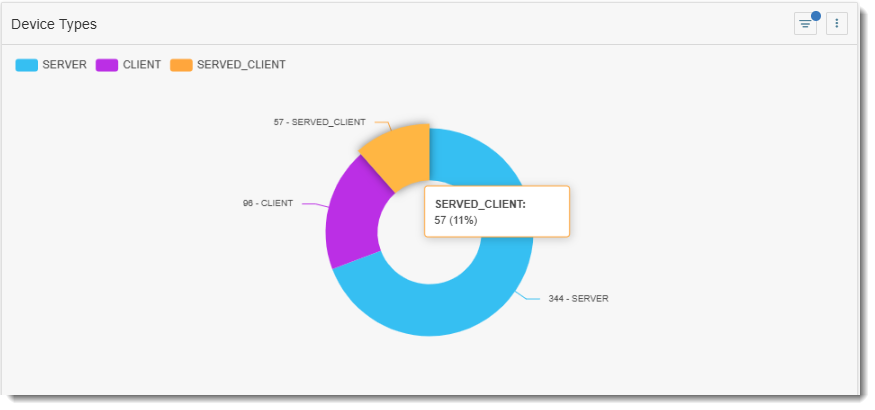
Tip:Click an area in the doughnut chart to focus on a particular device type. The filter you choose will also be applied to all other charts and the table on this page.
|
•
|
Monthly Trend Bar Chart “Devices Created”—Tracks how adoption of devices is growing month over month. |
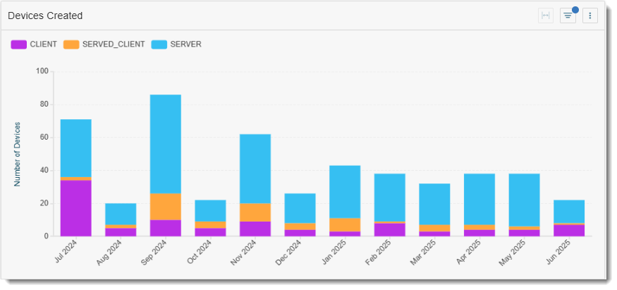
Tip:Click a bar in the bar chart to show the data for a particular month. The other graphs and table on the page will automatically apply the same filter.
|
•
|
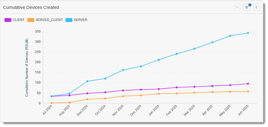
Cumulative Line Graph “Cumulative Devices Created”—Showing overall system engagement. |
|
•
|
Line Chart “Devices Updated”—Illustrates the number of devices updated each month over the past 12 months, offering insights into how frequently customers maintain or reconfigure their devices. |
|
•
|
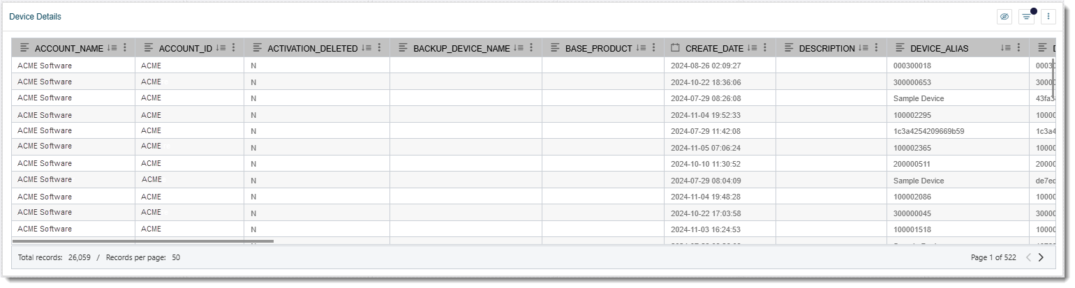
Table “Devices Details”—Provides visibility into each device and its associated events. |