Visuals in the Accounts & Users Report
The visuals in the Accounts & Users report provide insights into how accounts are split across the different account types—Customer, Channel Partner, Producer, and Self-Registered.
When correlated with projections, account creation trends offer valuable insights into:
|
•
|
Market traction, campaign performance, and onboarding effectiveness. |
|
•
|
Identification of high-performing regions or sales representatives. |
|
•
|
Support for pipeline forecasting and revenue planning. |
A decline in account creation—particularly when measured against targeted expectations—may indicate market saturation or challenges in the onboarding journey.
This insight enables teams to reassess current strategies and make necessary adjustments to better align with evolving market needs.
The Accounts & Users report includes the following visuals:
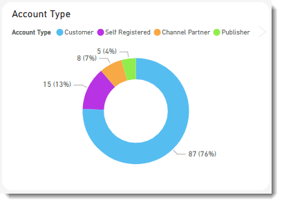
Account Type
The pie chart Account Type shows a breakdown of account types. Accounts are grouped into:
Accounts Trend
The Accounts Trend visual help track net growth and retention of active accounts over time. It combines two visuals:
|
•
|
The bar chart shows the number of new accounts created each month during the last 12 months. It also indicates the types of accounts that were created. |
|
•
|
The line graph shows the cumulative number of accounts created over the selected period. |
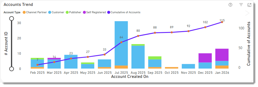
Click a bar in the bar chart to show the data for a particular month. The other visuals on the page will automatically apply the same filter (see Cross-Filtering and Cross-Highlighting of Visuals in a Report). Clicking the bar again removes the filter.
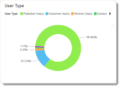
User Type
The pie chart User Type shows a breakdown of user types. User types are grouped into:
Click an area in the doughnut chart to focus on a particular user type. The filter you choose will also be applied to all other visuals on this page (see Cross-Filtering and Cross-Highlighting of Visuals in a Report). Clicking the area again removes the filter.
Users Trend
The Users Trend visual helps track net growth and retention of active users over time. It combines two charts:
|
•
|
The bar chart shows the number of new users created each month. It also indicates the types of users that were created. |
|
•
|
The line graph shows the cumulative number of users created over the selected period. |
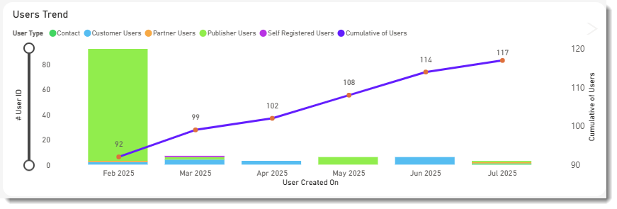
Click a bar in the bar chart to show the data for a particular month. The other visuals on the page will automatically apply the same filter (see Cross-Filtering and Cross-Highlighting of Visuals in a Report). Clicking the bar again removes the filter.