Metrics Overview
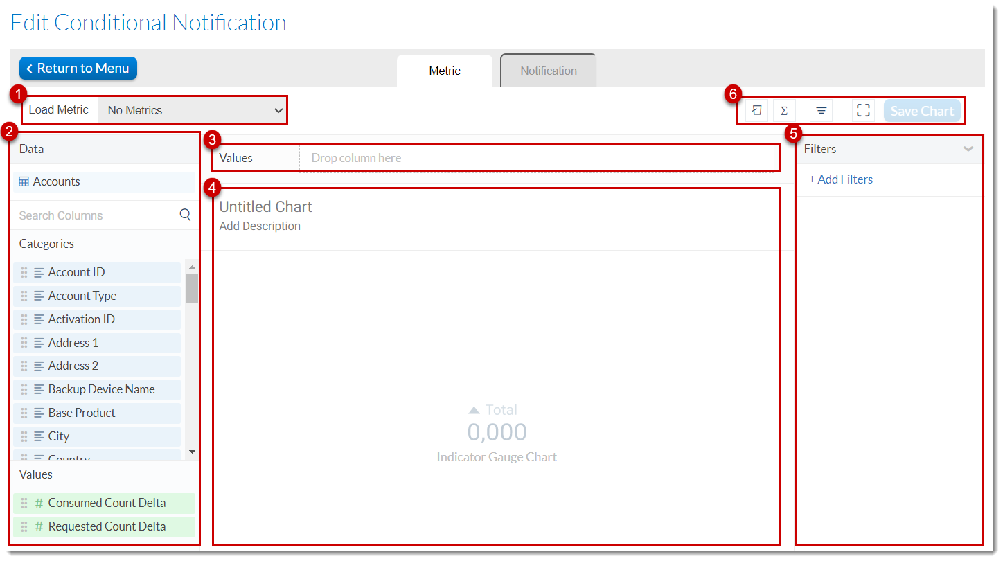
The various areas and panels of the Metrics tab are introduced in the following image:

Overview of the Metrics tab on the Edit Conditional Notification page
|
1.
|
Metrics Panel—Lists predefined metrics that are available to you. |
|
2.
|
Data Panel—Data fields from the selected dataset are listed in this panel and can be dragged and dropped in various areas of the screen to be analyzed. The data fields are divided into Categories and Values and their data type is presented with an icon next to each. |
|
3.
|
Values Shelf—You can drag and drop data columns that you want to analyze to the fields in this shelf. The number of fields in the shelf and their expected data types vary from chart to chart. Each column pill offers additional options for the field in it, like changing its data format, aggregation, sorting, etc. |
|
4.
|
Canvas—The area where your chart will appear and where you can add/change the name and description of the chart. |
|
5.
|
Filter Panel—Filtering enables you to focus on the portion of the data relevant to your analysis. See also Filtering Data. |
|
6.
|
Toolbar—A quick way to add buckets, formulas, and filters, and save your work, among other quick actions. For more information, see the topics Formulas, Bucketing Data, and Filtering Data. |
The Data Panel
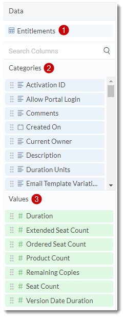
The Data Panel is located on the left-hand side of the Metrics tab and is where the data for the chart is picked from.

Overview of the Data Panel on the Metrics tab
|
1.
|
Dataset name—The name of the dataset you are currently using. |
|
2.
|
Categories—Categories are text and date type columns that can be used as dimensions that allow you to slice and group your data. They contain categorical information like country, customer name, created on, etc. |
|
3.
|
Values—Values are numeric columns that can be used as measures most of the time. Value columns can be used as they are, or be aggregated. Examples of aggregated values are remaining copies. |
Column Pill
Column Pills represent the dataset fields that appear either under Category or Value in the Data Panel. These column pills can be dragged from the Data Panel and dropped either onto corresponding shelves or directly onto the canvas to its corresponding axis. The values appear in blue (Category) or green (Value), regardless of the shelf or axis they’re dropped onto.
Text values are always considered as Category values, although in some cases they may not be good candidates for grouping. The following diagram shows what the values shelf looks like after a column pill has been added to it.

|
1.
|
The drag handle—a six-dot icon you can use to “grab and drag” the pill anywhere on the Metrics tab. |
|
2.
|
The name of the dataset field alongside a symbol that represents its data type. |
|
3.
|
The aggregation that has been applied to the value. |
|
4.
|
The three-dot menu where you can manage aggregation features. The content of the three-dot menu depends on the type of the value (Category or Value). |
|
•
|
Aggregation features for text values and date values: Count, Distinct Count |
|
•
|
Aggregation features for numeric values: Sum, Average, Median, Count, Distinct Count, Minimum, Maximum |


