Visuals in the Entitlements Report
The Entitlements report includes the following visuals:
| • | Entitlement Line Items Trend |
| • | Product Fulfillment Total vs. Available Quantity |
| • | Active Accounts by Business Region |
| • | Upcoming Renewals |
| • | Renewals Rate |
The Entitlement Line Items visual combines two charts:
| • | # Line Items—The monthly trend bar chart shows the number of new entitlement line items created each month during the last 12 months. |
| • | Cumulative of Line Items—The line graph of total entitlements highlights long-term growth patterns or plateaus. |
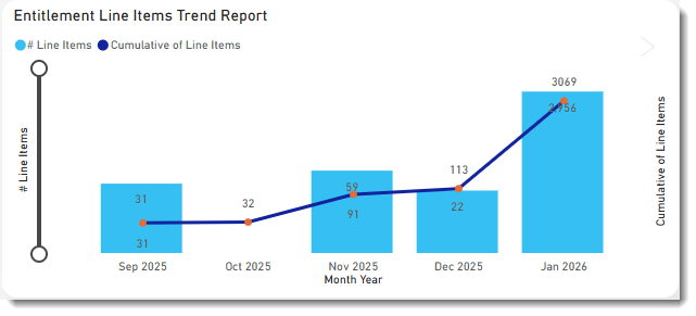
Click a bar in the chart to show the data for a particular month. The other visuals on the page will automatically apply the same filter (see Cross-Filtering and Cross-Highlighting of Visuals in a Report). Clicking the same bar again removes the filter.
Product Fulfillment Total vs. Available Quantity
The Product Fulfillment: Total vs Available Quantity bar chart shows the number of purchased entitlements vs the number of fulfilled entitlements per product.
Use the Product Fulfillment: Total vs Available Quantity chart to gain insight into the utilization of the licenses your customers have purchased. Grouped by product, the chart shows how many entitlements customers have bought and how many they’re actually using. The chart enables you to identify customers who are over-utilizing entitlements, which can then be targeted for upsell activities. Likewise, the chart will show whether customers are under-utilizing specific products, so that your Customer Success team can engage with those customers and ensure their satisfaction with your product.
The chart covers all license types, regardless of the license technology used. By default, the chart shows the number of all entitlement line items purchased grouped by product. The data can further be filtered by attributes such as account, entitlement IDs, line item activation IDs, product, or product version.
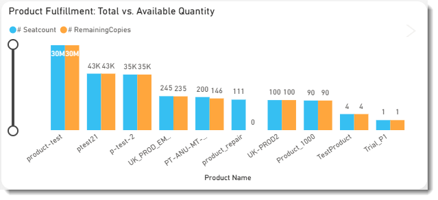
Example of the Product Fulfillment: Total vs. Available Quantity chart.
Active Accounts by Business Region
The Active Accounts by Business Region table shows the percentages of active vs expired accounts, grouped by the region in which the customer account is located. The table tracks churn over time, thereby helping producers gain insights into their customer retention KPI. It helps identify patterns and trends associated with customer departures, which impact their overall Annual Recurring Revenue (ARR) goals. For example:
| • | Which customers or accounts are canceling their software subscriptions or ceasing to use the software altogether. |
| • | The regions or countries with the highest and lowest churn rates. |
| • | Which products were most affected by churn. |
| • | When the churn occurred. |
Clicking a row for a specific business region changes the data in all visuals on the page to focus on the selected business region.
You can customize the table by filtering it to show only the region or accounts that you want to focus on. The table is based on data from the Entitlements data set and covers subscription licenses only.
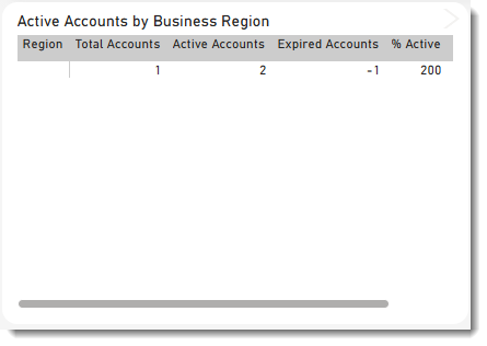
An example of the Active Accounts by Business Region table.
Click a data point in the table and click the > arrow in the top right corner of the visual to drill through to Renewals.
Note:Note the following for the Active Accounts by Business Region table:
| • | An account is considered active if it has one or more entitlements with an expiration greater than the current date. |
| • | The data for the Active Accounts by Business Region table is based on the Entitlements data set and covers subscription licenses only. Therefore, a global filter has been defined for an expiration date of 8000-01-01, which filters out any permanent licenses. |
| • | For a reference of the country groupings into the different business regions, see Countries by Region. |
| • | The business regions referred to in the context of this table are different from the region that you can optionally specify when you create an account. The region that you specify during account creation is not taken into account in the Active Accounts by Business Region table. |
The Upcoming Renewals chart is designed to help teams manage and track software entitlements that are approaching their expiration dates.
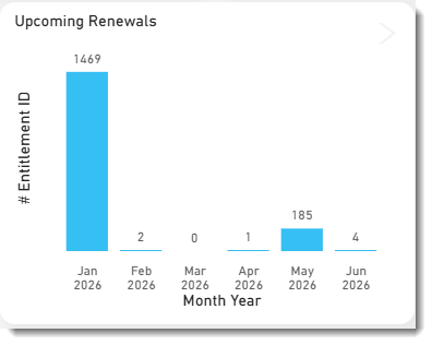
Example of the Upcoming Renewals chart.
Click a data point in the table and click the > arrow in the top right corner of the visual to drill through to the Upcoming Renewals Listing table.
Upcoming Renewals Listing Table
The Upcoming Renewals Listing table provides a detailed snapshot of each entitlement that is about to expire with the specified time frame (default: 12 months).
The Renewals Rate table provides a high-level summary of renewal performance across global regions and time periods. It breaks down renewal and expiration volumes by quarter, enabling data-driven decision-making around customer retention and support resource allocation. Also, this table helps identify trends over time, highlighting areas where renewal rates are strong and where improvements are needed. It also serves as an early warning system for potential churn, allowing proactive measures to be taken.
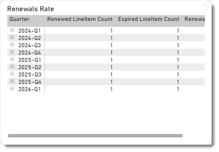
Example of the Renewals Rate table.
Click a data point in the table and click the > arrow in the top right corner of the visual to drill through to Renewals. For more information, see Tabular View of Entitlements Data.